My Role
- Product Designer
- User Research
- Visual design
Project Overview
- Timeline: 4 Weeks
- Tools: Figma, Chatgpt, Whimsical
- Team: Solo Project
Introduction
Yelle is a mobile app that helps entrepreneurs and small business owners sell products, manage customers, and receive payments from anywhere in the world.
The idea started from a common problem. Many small sellers use multiple apps to run their business—WhatsApp for customer chats, Instagram for product display, and banking apps for payments. The result is scattered data, missed payments, and unnecessary stress.
Yelle brings everything together in one mobile experience. It gives small business owners a clean, reliable way to sell and get paid without switching apps.
Problem
Small business owners want to grow, but the tools available to them are often designed for big enterprises.
They struggle with:
- Managing multiple apps for sales, orders, and payments.
- Delayed or missing payment confirmations.
- No clear overview of their store performance.
- Complicated interfaces that waste time.
For many, this leads to confusion and burnout.
I wanted to design an app that keeps their entire business in one place—simple, visual, and fast.
Users
I focused on small vendors, freelancers, and online sellers who handle their business independently.
Through ten interviews with sellers who use Instagram and WhatsApp to sell, I learned:
- 8 in 10 rely on screenshots to track who paid.
- 6 in 10 record their orders manually.
- 5 in 10 said they lose customers because of poor follow-up.
I created a persona named Mariam, a home-based fashion vendor.
She sells ready-made dresses online and uses different platforms to handle sales and payments.
Her biggest frustrations were:
- Too many apps for one simple process.
- Not knowing who had paid.
- Spending hours tracking orders.
Her goal was simple: one mobile app that handles sales, payments, and customers without friction.
Process
I started with user interviews and competitor reviews.
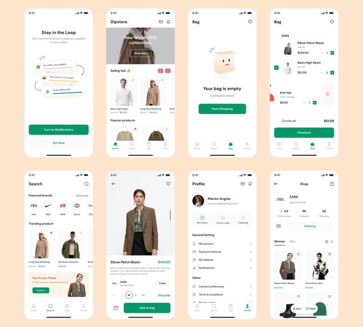
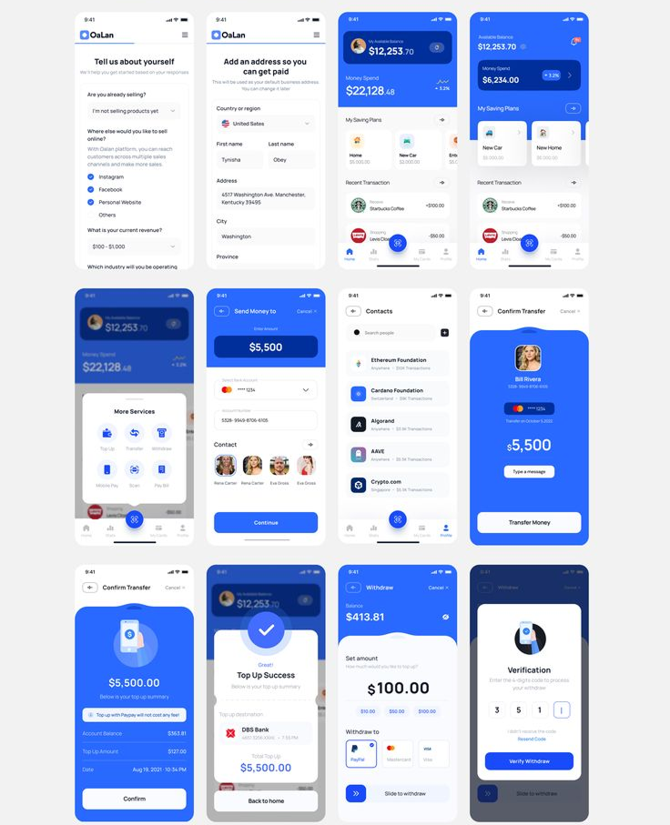
I studied platforms like Flutterwave Store, Paystack Storefront, Shopify Lite, and Selar.
They offered strong features but were too complex for small-scale sellers.
The insight was clear:
Users wanted speed and simplicity, not dashboards filled with data they didn’t need.
They wanted fewer steps and faster results.
I summarized my research into three principles for Zelle:
- Simplicity over sophistication – every screen must be easy to use at first glance.
- Clarity in actions – no hidden buttons or confusing navigation.
- Confidence in control – users must always know what’s happening with their sales and money.
Ideation
Once the goals were clear, I started mapping the structure.
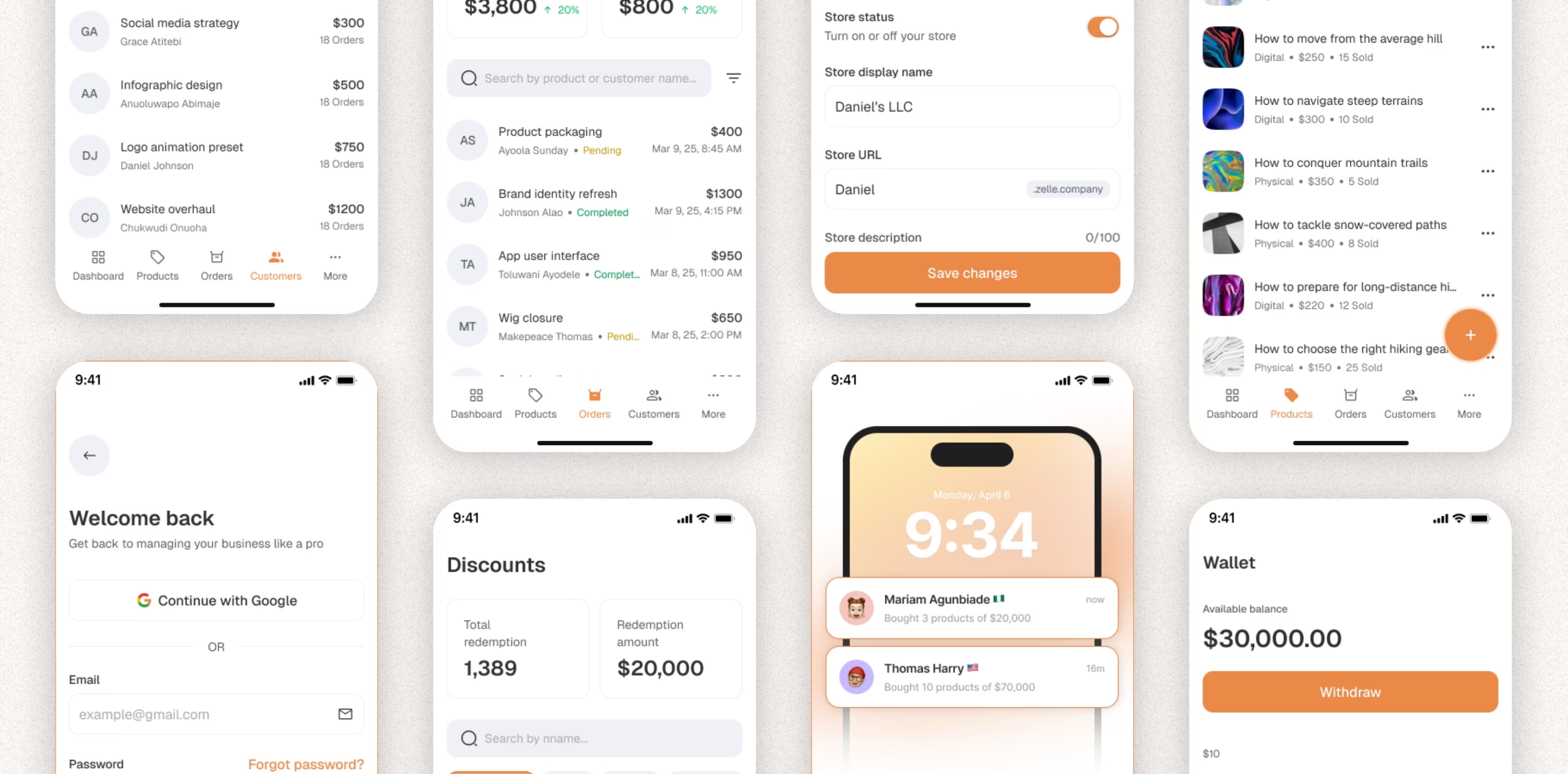
The app would have five main flows:
- Onboarding – clean, fast setup for new users.
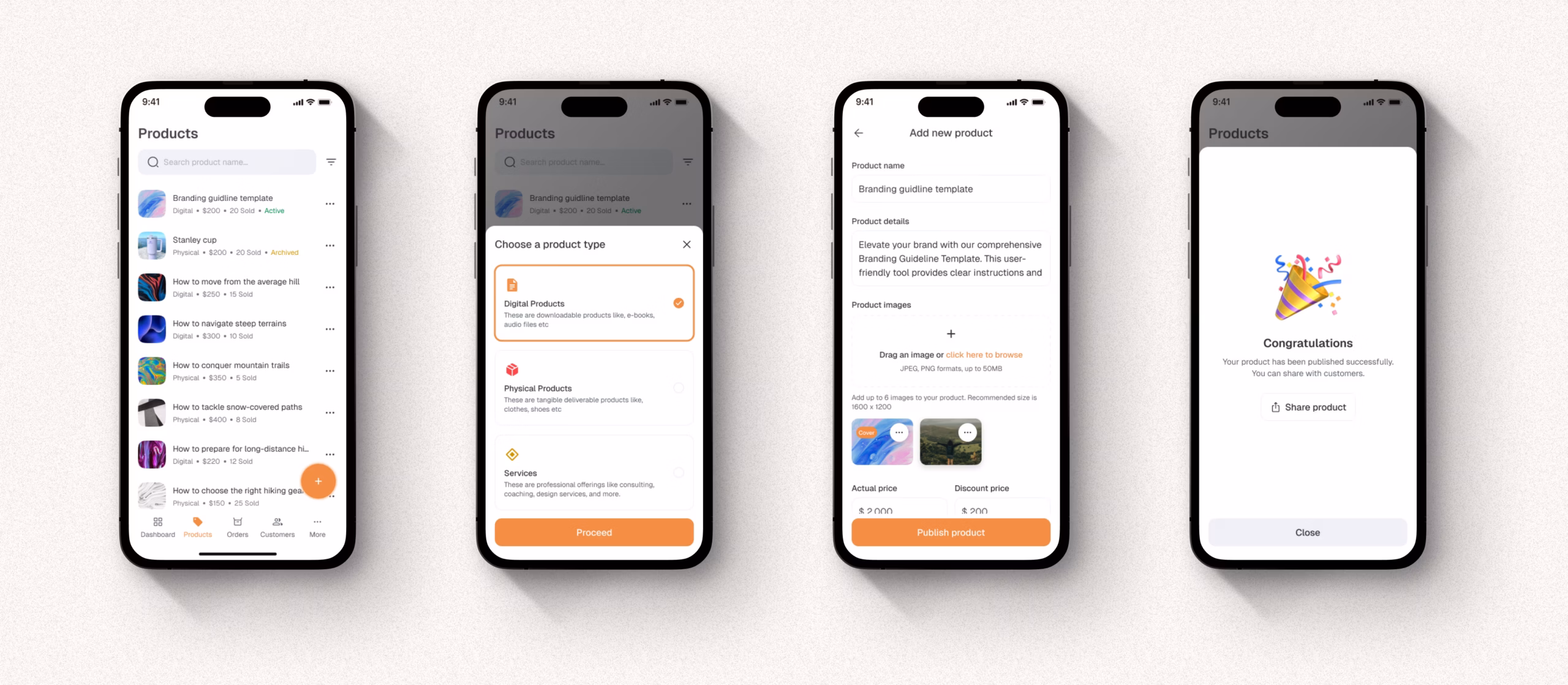
- Products – simple upload with images, prices, and stock levels.
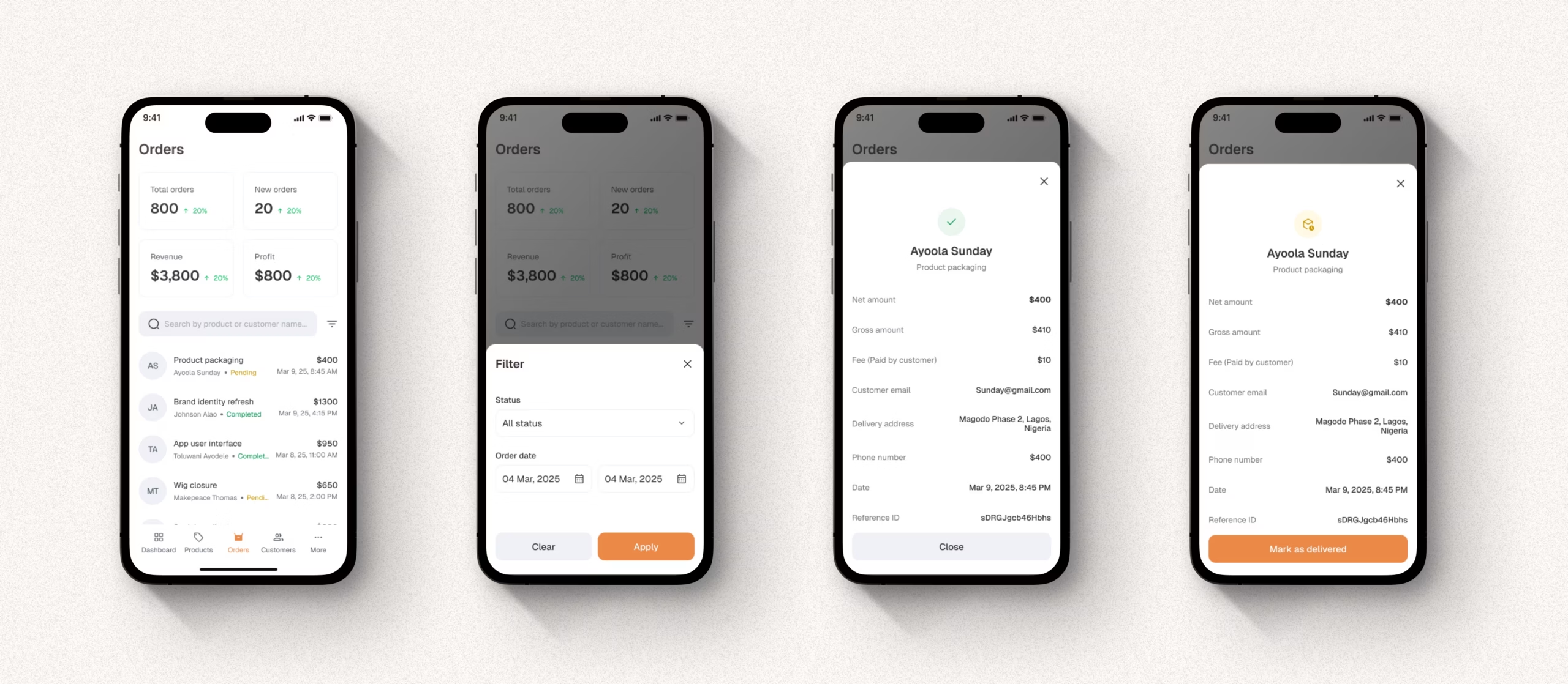
- Orders – track new and completed orders.
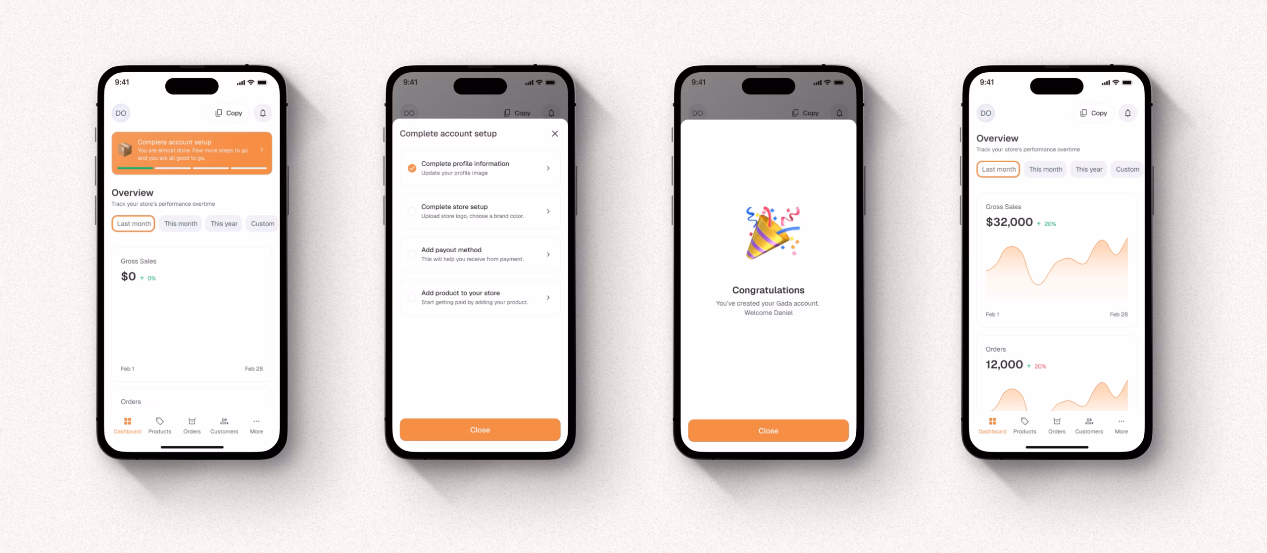
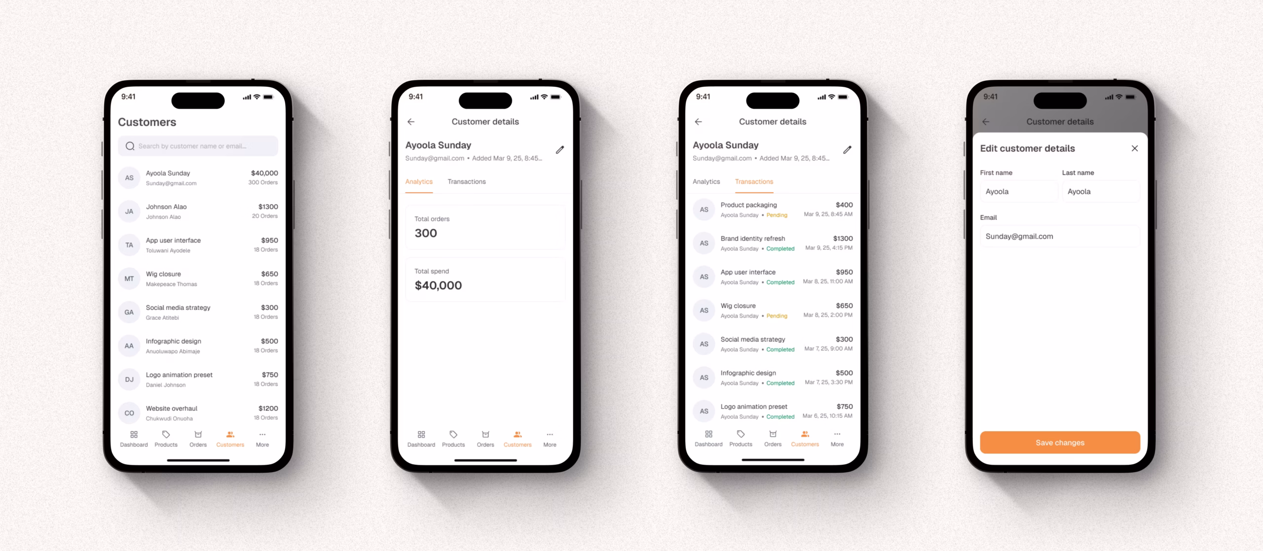
- Customers – view buyer details and communication history.
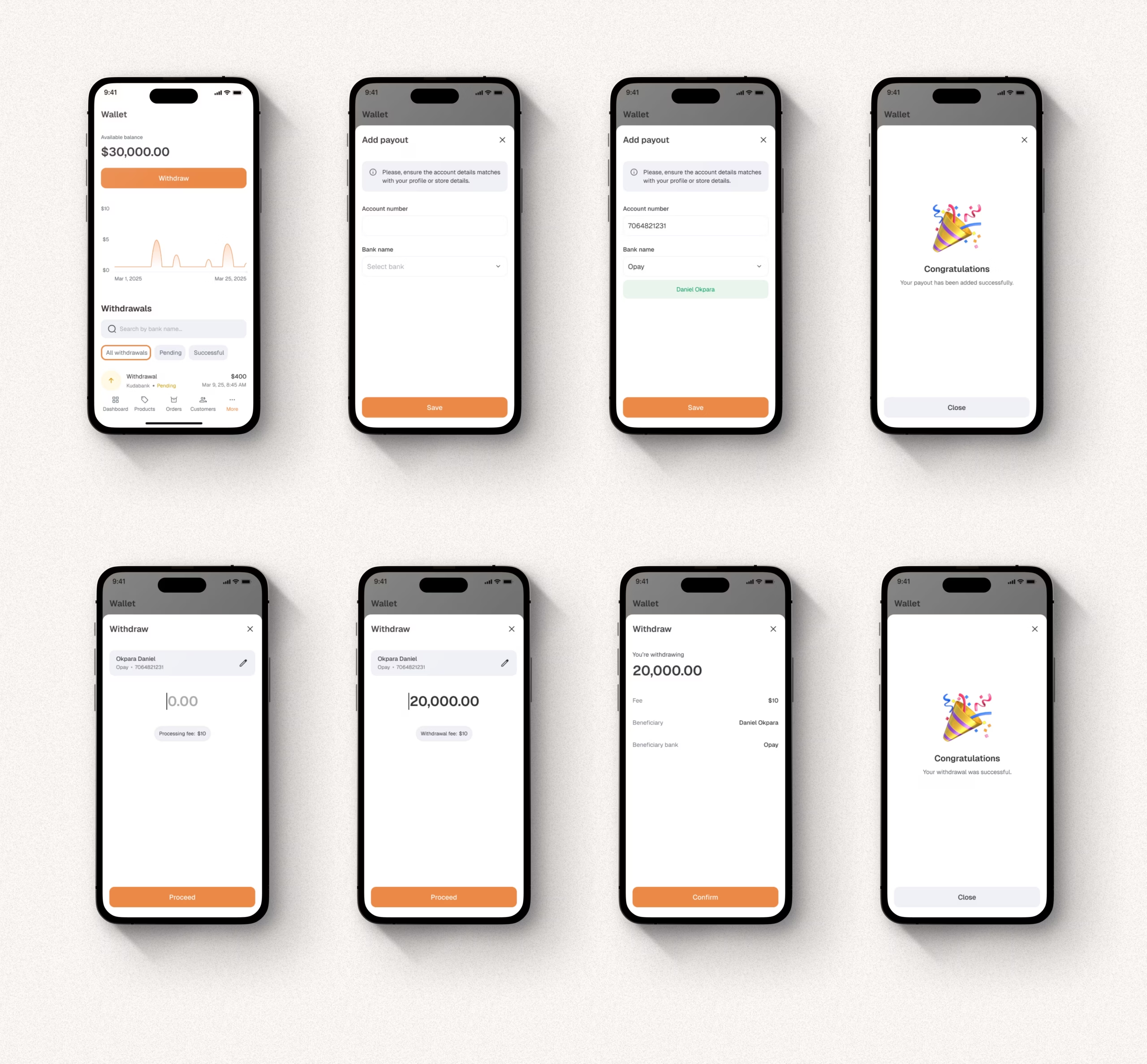
- Wallet – check available balance and request payouts.
Each flow was designed to take no more than three taps from the home screen.
My early sketches focused on visual hierarchy—how users could get what they need without scrolling endlessly.
Design
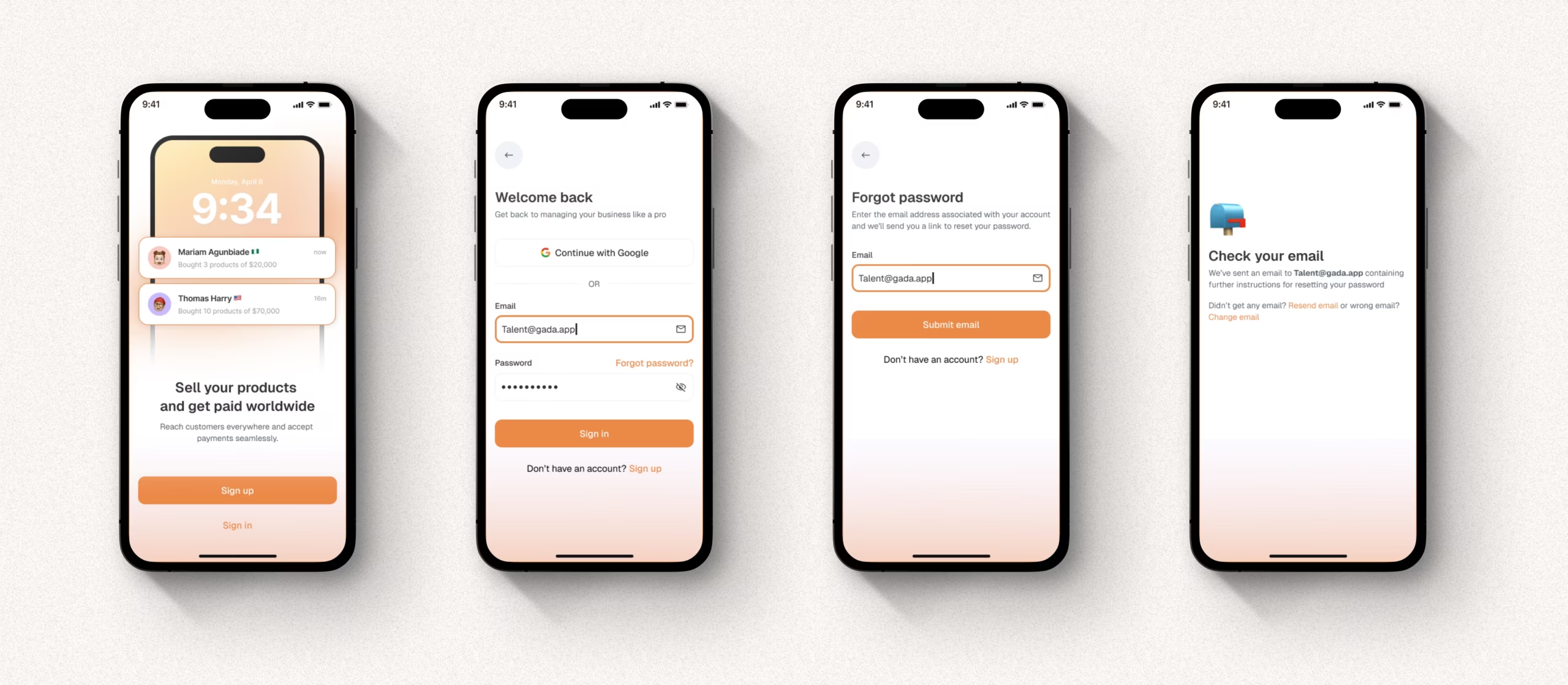
I wanted Yelle to feel warm and trustworthy.
I used soft orange and white tones to create a sense of energy and optimism.
The interface relied on large typography, bold icons, and clear spacing.
The home screen greets the user with an encouraging message:
“Sell your products and get paid worldwide.”
Below it, a real-time update shows what’s happening:
Mariam Agunbiade bought 3 products worth $20,000.
This makes the experience feel alive. Users see proof of sales instantly.
Her goal was simple: one mobile app that handles sales, payments, and customers without friction.
Testing and Iteration
I tested the interactive prototype with six small business owners.
Their feedback was both insightful and practical:
- They loved the clean layout.
- They wanted a faster way to add new products.
- They needed clearer access to customer details.
- They asked for one-tap payout requests.
These inputs shaped the next version of Zelle.
I refined the design to include:
- A “Quick Add” button for instant product upload.
- A Customers tab with past purchase history.
- A Payout shortcut directly from the home screen.
Each iteration made Zelle more aligned with user behavior.
After updates, testers described it as “simple and straight to the point.”
Solution
Yelle gives small business owners full control of their sales and payments without needing multiple tools.
Key features include:
- Seamless onboarding for quick setup.
- Real-time notifications on every sale.
- Product dashboard with image previews.
- Customer management with order history.
- Instant payouts to local or international accounts.
Everything lives inside one mobile app that feels friendly, modern, and reliable.
It’s built for people who run their business with their phones, not a desktop computer.
Impact
After final testing:
- 85% of users said Zelle saved them at least 30 minutes daily.
- 75% said they preferred it over their current tools.
- 90% said they felt more organized and confident using it.
The biggest takeaway was clarity.
Users said they “knew exactly what to do” the first time they used it.
That kind of feedback means the design achieved its goal—simplicity that builds trust.
Conclusion
Yelle is more than a payment app. It’s a simple business partner for small sellers.
It helps them handle sales, track customers, and withdraw earnings without stress.
Designing Yelle taught me how much clarity impacts user confidence.
When design feels effortless, users focus on their business, not the app.
That is what good design should do—make work feel easier
